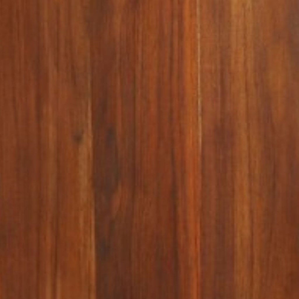
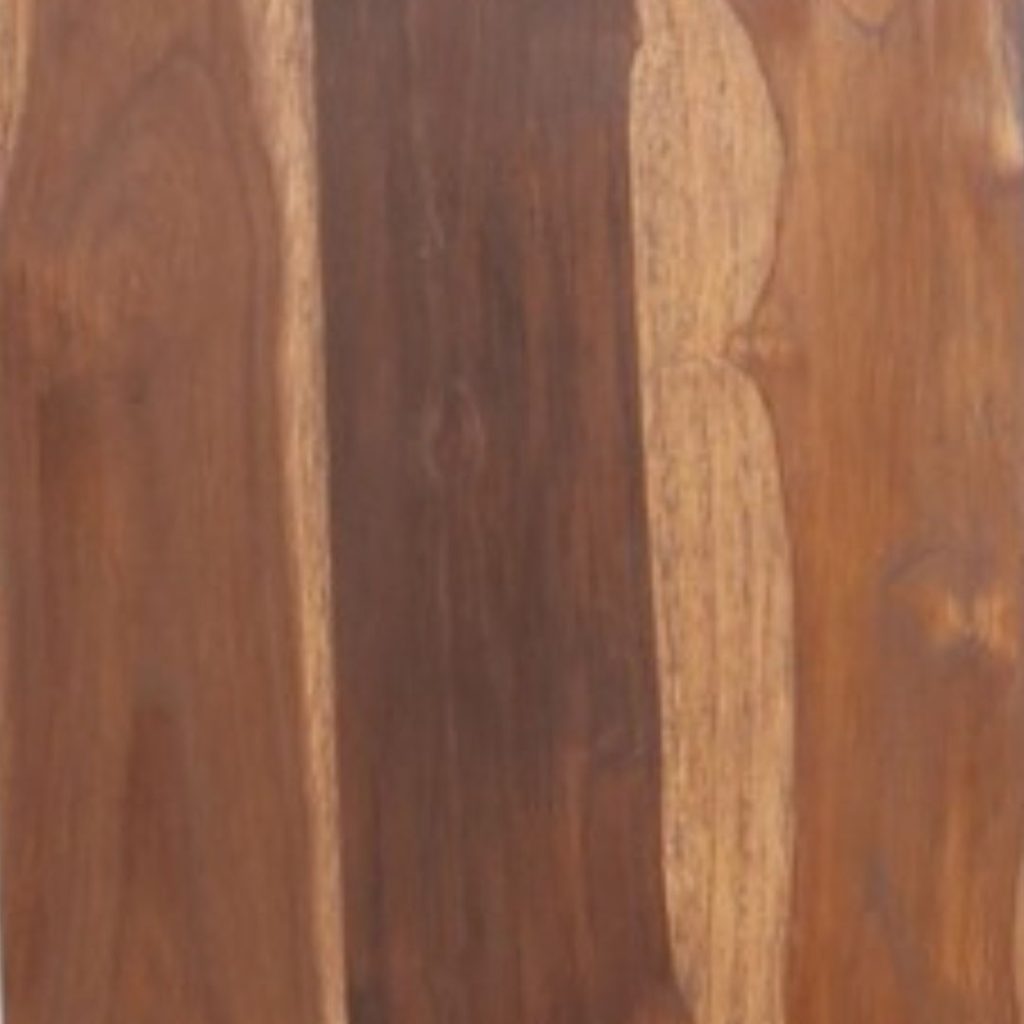
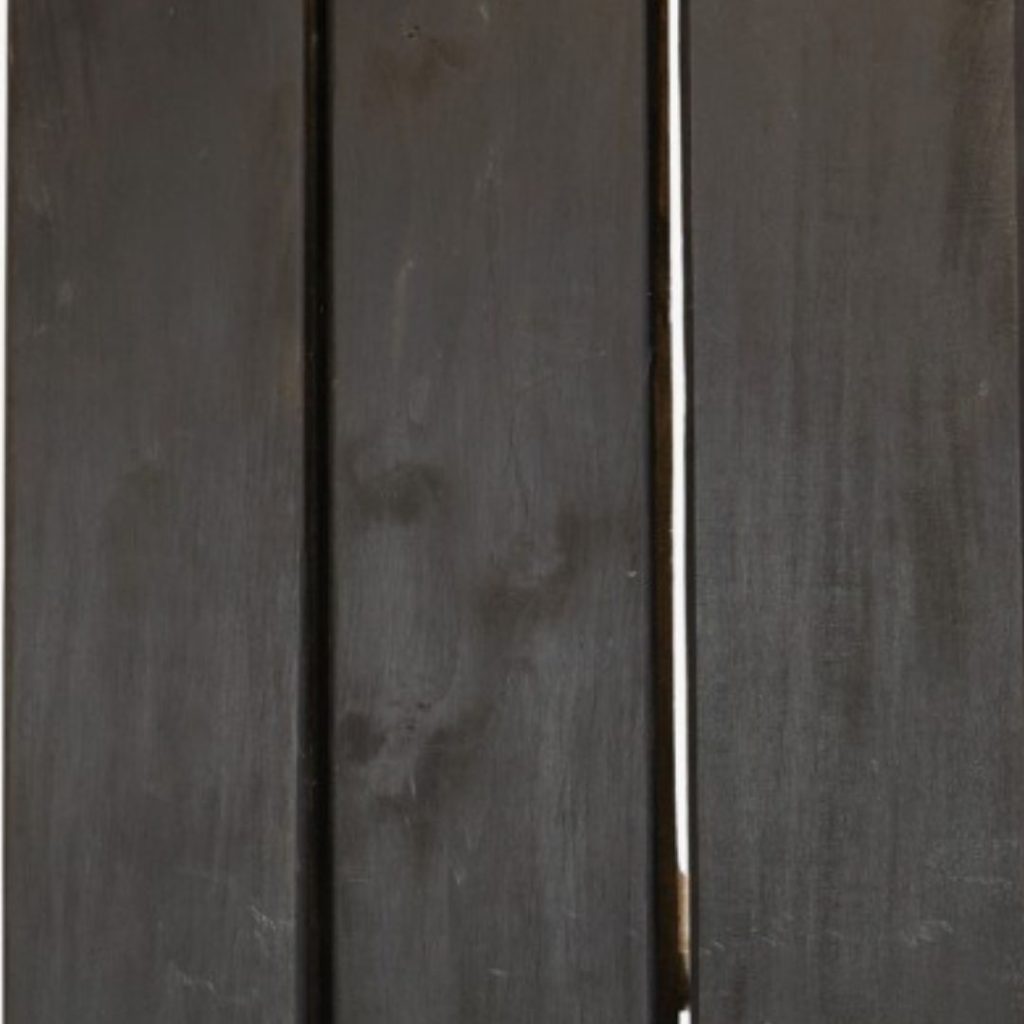
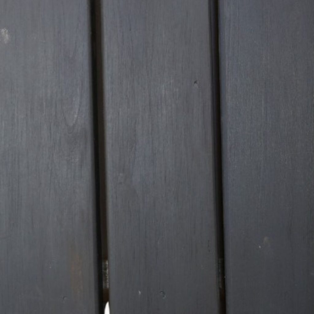
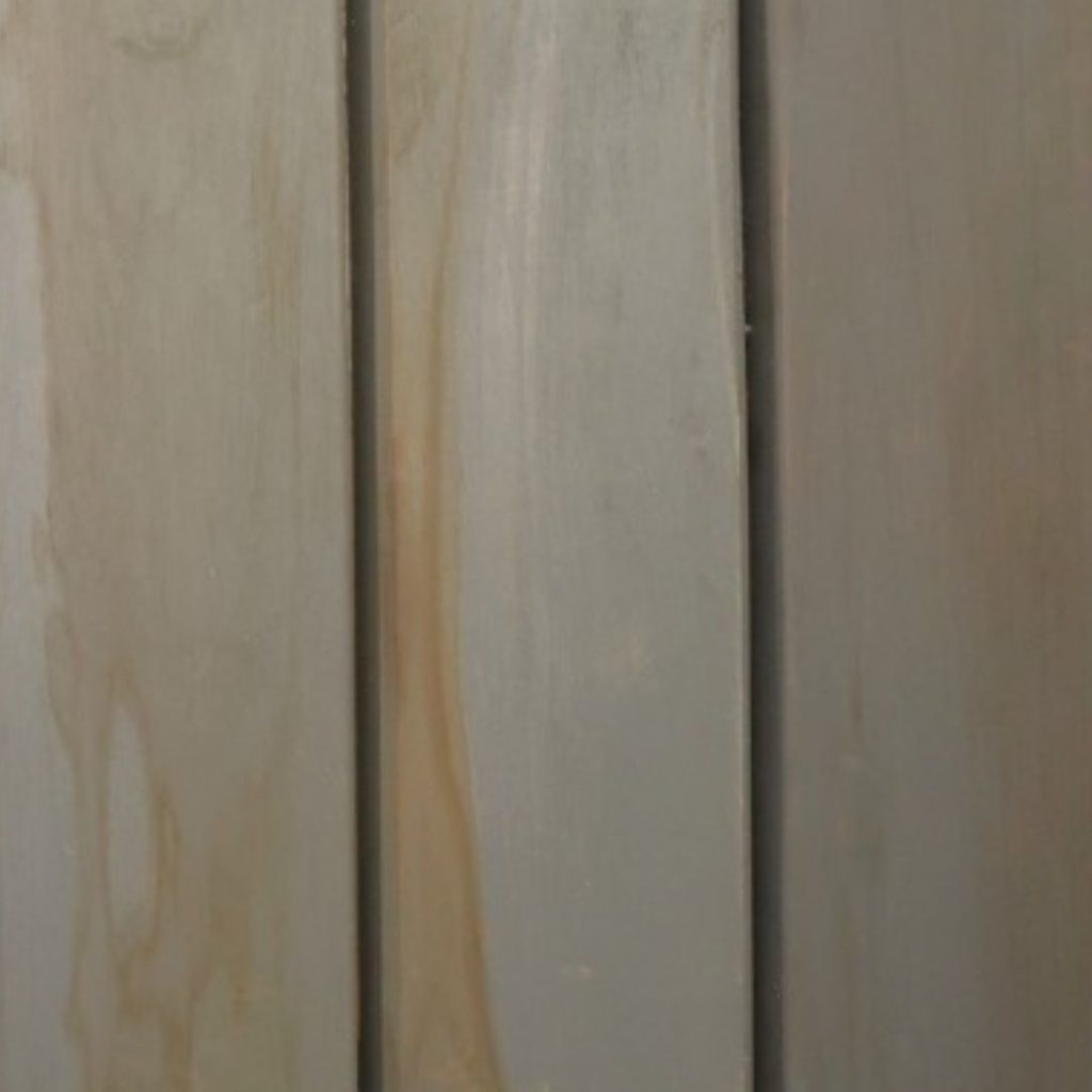
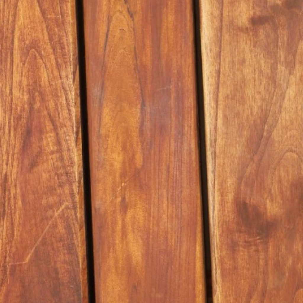
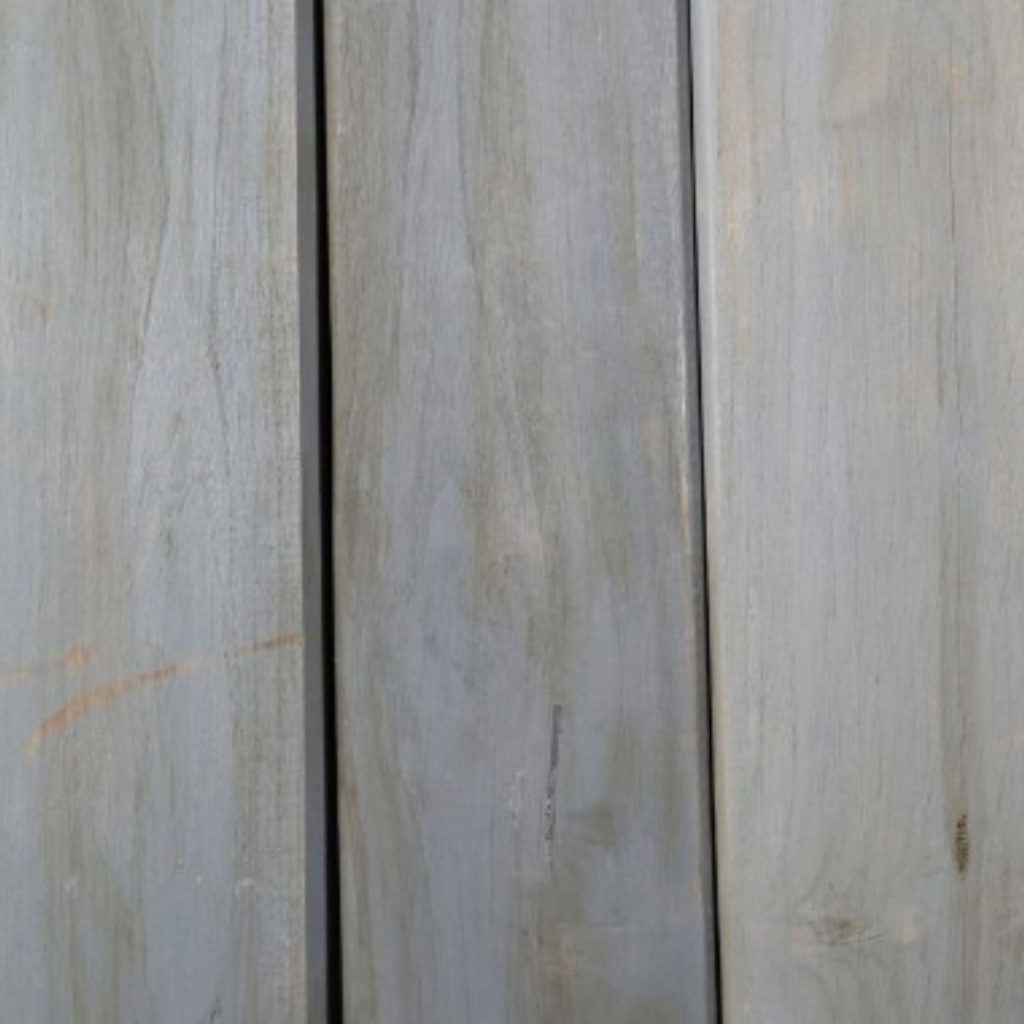
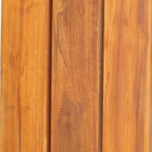
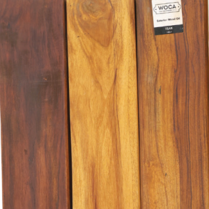
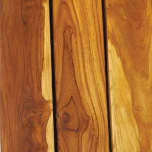
Natural
— Clear, penetrating oil — Enhances grain without tint Natural keeps the wood honest, warm, clear, and richly grained.
White
— Soft whitewash — Contemporary, bleached vibe A Scandinavian lightening that keeps interiors bright.
Extra White
— Stronger whitening — Counters yellowing Higher white pigment levels create a pronounced bleached eect for minimal spaces that still show real-wood texture.
Sand Grey
— Pale beige-grey — Soft desaturation A light coastal tint that tones down color without flattening texture, ideal for relaxed, Scandinavian palettes.
Smoke Brown
— Smoked-oak effect — Adds visual depth Subtle darkening echoes traditional fuming, intensifying the figure for moody, characterful interiors.
Chocolate Brown
— Rich dark brown — Lux, furniture-grade look A sophisticated dark tone that delivers high contrast and a premium finish for stair treads, floors, and joinery.
Caramel Brown
— Warm mid-brown — Evens color variation Caramel tones enrich pale boards and unify mixed hues, adding a welcoming, traditional character.
Carbon Black
— Deep charcoal — Bold contrast This strong, charcoal tone grounds spaces and sharpens lines while highlighting grain under low sheen.
Concrete Grey
— Cool neutral — Urban minimalism Cools warm undertones for a refined, architectural feel that pairs eortlessly with stone, steel, and glass.
Hazelnut
— Warm nut-brown — Restores faded timber Hazelnut refreshes sun-tired boards with a soft brown hue that feels organic in gardens and lodges.
Black
— Opaque coverage — Architectural edge A striking, uniform tone that makes cladding and screens read as sculptural planes while protecting the wood.
Anthracite
— Dark graphite — Sleek contemporary tone Cooler than black, Anthracite delivers refined contrast that pairs well with metalwork and concrete.
Merbau
— Red-brown tint — Tropical warmth Adds saturated reddish notes that revive dense hardwoods and create a vibrant resort feel.
Grey
— Soft silvering — Weathered effect Mimics the gentle silver patina of sun-aged wood while protecting surfaces from the elements.
Bangkirai
— Golden-brown match — Species-tuned tone Restores and unifies bangkirai and similar hardwoods with a warm golden hue that resists fading.
White
— Pickled lightening — Coastal aesthetic Soft white pigments lift dark decks and façades, giving a weather-friendly coastal look that stays clean and light.
Stone Grey
— Mid neutral grey — Timeless balance Stone Grey levels out color shifts for a classic, low-maintenance appearance that complements most materials.
Walnut
— Deep brown — Refined, grounded look A rich, darker exterior tone that adds sophistication to pergolas, façades, and outdoor joinery.
Teak
— Classic golden-teak — Suits premium decks Enhances figure with a familiar golden tone that partners perfectly with marine, lodge, and luxury outdoor settings.